Anniversary Logo
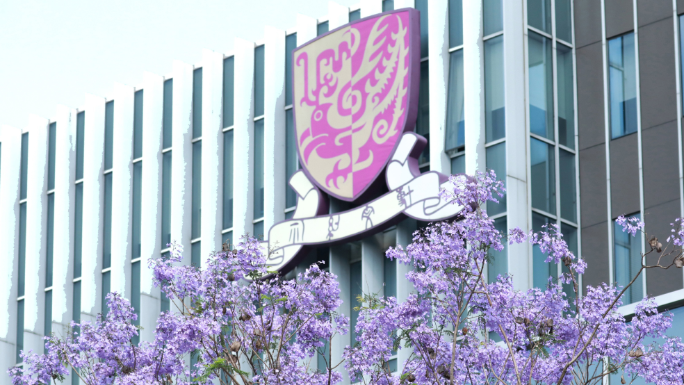
Embracing the founding mission of CUHK-Shenzhen ('to combine tradition with modernity, and to bring together China and the West'), the logo reinterprets the iconic "Phoenix" motif from the university emblem using contemporary expression techniques. The Phoenix, symbolic of nobility and aesthetic beauty, gracefully captures the essence of vitality and inventiveness of the campus.

The Phoenix Motif


The logo seamlessly weaves the numeral “10”, indicative of the decennial celebration, with the phoenix's representation. Donned in the university emblem's colour palette of purple and gold, the symbol takes on a modern, sleek, and minimalistic form. The play of "feibai" in calligraphy - an artistic technique that leverages white spaces to impart a sense of movement and vitality - breathes life into the design and powerfully conveys a portrayal of our institution as vigorous and thriving. Overall, the work attempts to project CUHK-Shenzhen as a progressive university that harmoniously converges Chinese and Western cultures, while simultaneously striving for excellence and sustaining Chinese cultural heritage during its ten years of journey.

This symbol has been crafted and interpreted to illuminate the unique persona and cultural legacy of CUHK-Shenzhen, marking both a celebration and a commemoration of its significant tenth-anniversary milestone.